Bengaluru metro was once again in the news for a proposed price hike which was subsequently put on hold. It is already the most expensive metro network in India and achieving profitability is usually cited as the motivation for price hikes. First and foremost, a metro network does not need to be profitable in my opinion. Profitability was never the question while building Vidhana Soudha or even the Ejipura flyover for that matter. In a city like Bengaluru choked with traffic, it is worth spending the taxpayer money on metro for the common benefit even if it is not profitable. The true success of the metro system lies in the number of precious human hours saved from being behind the steering wheel/handle. Finally, as a civil society we’d be better off transferring the burden of profitability from core infrastructure to those useless 10-minute services. Why should metro be profitable when even Zepto isn’t?
Having said that, it is worth looking into what can be done to increase the revenue, and exploring what the ridership data has to say about the revenue. The wonderful folks at diagramchasing.fun filed an RTI to get the daily ridership data of Namma Metro for the period between August 1st and 18th, 2025 and wrote an interactive blog post pulling out some fun facts and analyses from the data. The raw data itself consisted of multiple fields, out of which I took specific interest in the large table detailing how many passengers travelled between each station pair during each hour of each day in the said period. I enriched this data by adding the number of stations between these station pairs and revenue generated in that hour for the station pair. The raw data including my enhancements is available at https://github.com/Vonter/bmrcl-ridership-hourly.
The next question is, can we use this data to explore some ideas to optimize pricing and increase the revenue? Let’s dive right in!
1. Trend of Number of Stations Travelled
Bangalore metro, like most other Indian networks is priced primarily based on the number of stations you travel once you enter the system. This is unlike many other systems such as New York’s MTA or Mexico City Metro which charge a flat fare for you to enter the system regardless of where you’re travelling. Assuming such a distance-based pricing scheme is for enforcing some sense of fairness, let’s look at how that has worked out. Below is the distribution showing number of stations travelled in the metro system on the X-axis, with the number of people travelling for that many number of stations and the revenue generated for the same, on the Y-axis:
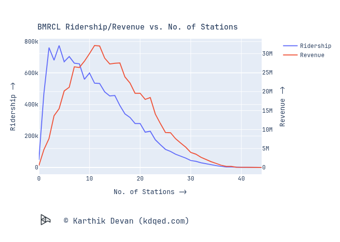
From the above chart, we see that ridership peaks around 3-5 stations while the revenue peaks around 11-12 stations. In general, the ridership curve is to the left of the revenue curve. This means, on a per ride basis, folks who use the metro for short distances are contributing disproportionately lesser to the revenue than folks who travel longer. In one sense of fairness, if we try to have each ride contributing equally to the revenue, both the curves need to overlap. One way of attempting this is to increase the price by a disproportionately higher rate for shorter distances than for longer distances. Whenever the next price hike is considered, the maximum could stay at ₹90 or even be reduced a bit, while the minimum can be hiked to ₹15 or ₹20.
2. Ridership vs. Date
Let’s look at the ridership for each day in the 18-day period the data is available for:
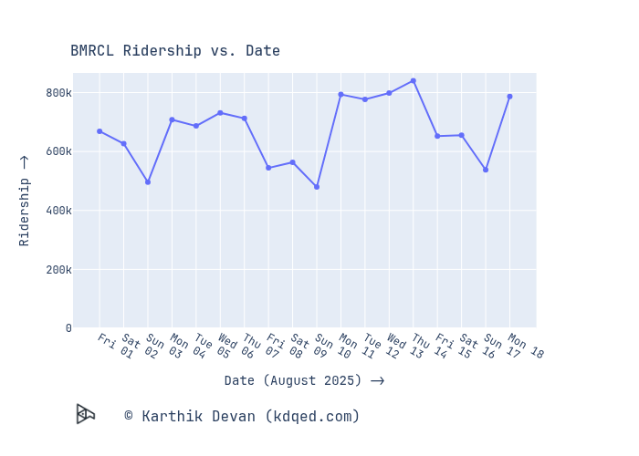
From the above data, we see a weekly pattern, with an increase after after the inaugration of the Yellow Line on August 10th. One interesting, non-intuitive observation is that Friday ridership is almost equal to Saturday ridership for all the 3 fridays in the time period (not just for August 15th, which is a holiday). One would typically expect weekdays to have similar ridership and weekends much lesser than that, the pattern here suggests most people commuting to work on either 4 days of the week or 6 days of the week, while Sunday is a holiday.
To motivate more folks to use the metro, while also using the unused capacity on Friday, Saturday and Sunday, there could be special discount schemes for those days. For example, on the New York MTA, if one completes 12 rides within a week using the same card, their subsequent rides in that week are free. On similar lines, perhaps we could have standard pricing for the first 8 rides in the week (4 days of to and fro work commute), a discount for the next 4, and everything after that discounted further or free. This system is just easier to communicate and implement with existing metro cards over dedicated passes which have to be bought separately by passengers.
3. Revenue vs. Hour
Let’s look at how ridership varies by the hour of the day:
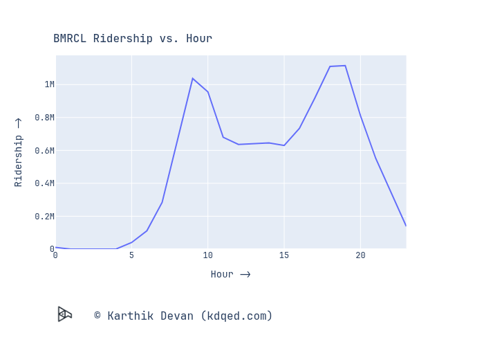
Aside from the figure looking like a cat’s face, it shows two very obvious peaks when people go to work and return from work. Perhaps there could be a discount for non-peak hours to have more folks commuting during those hours?
4. Ridership vs. Station
One of the significant sources of non-fare revenue are the stations themselves. The stations have real estate that can be turned into revenue by renting space for commerical activities and advertisements. Some stations have already been monetized via naming rights as well. In any case, it would be disappointing to see a commercialization to the extent of some Chennai Metro stations. These stations have been externally branded so much that they don’t even look like metro stations any more.
When we start looking at the station as the fundamental unit of non-fare revenue, it would make sense to evaluate each station by it’s footfall to assess its value in some sense. So let’s look at the stations that have the most footfall as origin or destination stations:
Top 10 Origin Stations:
| Origin Station | Ridership |
|---|---|
| Nadaprabhu Kempegowda Station, Majestic | 626056 |
| Benniganahalli | 469307 |
| Indiranagar | 380598 |
| Mahatma Gandhi Road | 372369 |
| Krishnarajapura | 327496 |
| Mantri Square Sampige Road | 295139 |
| Chickpete | 284844 |
| Yeshwantpur | 251692 |
| Jayanagar | 237281 |
| Cubbon Park | 234919 |
Top 10 Destination Stations:
| Destination Station | Ridership |
|---|---|
| Nadaprabhu Kempegowda Station, Majestic | 842201 |
| Benniganahalli | 412103 |
| Indiranagar | 401228 |
| Mahatma Gandhi Road | 383640 |
| Chickpete | 305663 |
| Krishnarajapura | 304195 |
| Mantri Square Sampige Road | 297666 |
| Yeshwantpur | 258883 |
| Krantivira Sangolli Rayanna Railway Station | 248569 |
| Jayanagar | 244231 |
The top 6 on either list are the same, amongst the next 4, Yeshwantpur and Jayanagar occur on both lists. These are the stations that could be prioritized for non-fare revenue.
Conclusion
In this blog, I tried to look at how the metro ridership could be used to make some pricing and revenue decisions. Of course, the data considered here is very limited and the suggestions and decisions are subject to change with more extensive data. So effectively, these sections are just a presentation of some metrics we can use in the revenue department.
Finally, quoting the original diagramchasing blog:
All the above analysis stems from a single dataset. For organizations such as BMRCL, the takeaway should be obvious, which is to release this data regularly. When data is available and covers a long period of time, it can be used to answer a much wider range of questions, more accurately and with greater detail. You can’t beat the cost of getting analysis and insights from the public, for free. If you are from BMRCL (or another government agency), please consider releasing data like this regularly.
Footnotes
- This analysis is based on the BMRCL ridership data obtained and published by Vivek Matthew.
- The code used for the analysis is on my GitHub
[This article is republished with permission from the author’s blog post]