Maps are useful to visualise data that is geographical in nature. For e.g. health parameters like Infant mortality rate or Maternal mortality rate given for all states of India can be better visualised as a map of India with the different values colour-coded.
Maps in Opencity are of the format – kml. Kml is Google’s format and works best with Google maps. Another similar format you will come across when working with maps is kmz, which is nothing but a zip file which contains a kml file. You just need to rename the .kmz to .zip and extract the .kml file. The other common map formats are shapefiles and geojson, and there are online converters that can help you switch between formats if you so need.
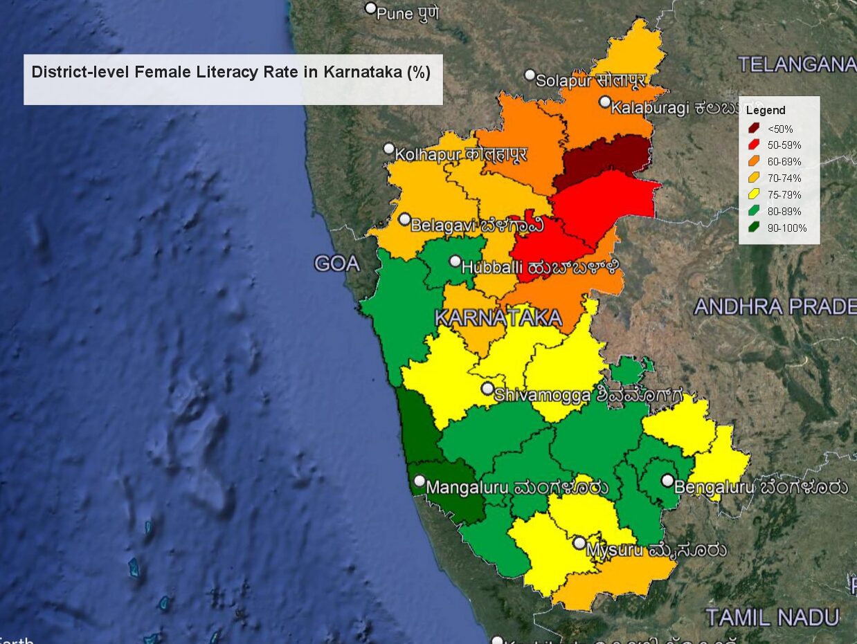
Here, we walk you through an example where we combine the districts map of Karnataka with the Female literacy rate in different districts of Karnataka.
- Latest female literacy rates can be found for all districts in the National Family and Health Survey 5 (2019-21) Karnataka compendium in Opencity. The field you are looking for is point 14. Women who are literate. This value is the percentage of woman who are literate. Collect the data for all 30 districts into one place.
- Download and install Google Earth Pro from here.
- The districts map of Karnataka can be found in Opencity. Download the kml file.
- Open Google Earth Pro, select File->Open and select the downloaded kml file.
- It will show Karnataka under “Temporary Places” in the “Places” panel on the left. Select the checkbox next to Karnataka Districts and it will show Karnataka with the district boundaries marked.
- One of the ways to represent data like the female literacy rate, which is a percentage number, is to separate it into categories.
- Given the spread of the data, slotting the data into categories of 10 percentage points each can be useful. For eg, all districts with less than 50% can be one category, those 50-59% can be one category, 60-69% can be the next category and so on. Given that there are a lot of districts in the 70-79% cohort we can make it more granular and divide the districts into 7 categories as follows: < 50%, 50-59%, 60-69%, 70-74%, 75-79%, 80-89% and 90-100%.
- Once we have the categories we need to pick colours for them. Red is usually a colour that represents an undesirable result, while green represents the best result. For 7 categories, we can choose the colours as dark red, a lighter red, orange-red, orange, yellow, light green and dark green.
- To set a colour for a district, on Google Earth, right click on a district, say Yadgir which has a value of 48%, and select ‘Properties’.
- On the window that opens, select the “Style, Color” tab.

- In this dialog,
- Select the line colour under “Lines” to be black.
- Under the “Area” section, set the dropdown to “Filled+Outlined” and “Opacity” to 100%.
- Uncheck the “Random” checkbox if it is set. This is important as otherwise Google Earth will not use the colour of your choice.
- Choose the box with colour next to ‘Color’, and set the appropriate category colour in the next dialog. In this case, since we are looking at the district with the least value, the colour would be a dark red.

- Note down the HTML value which is rounded above. Just enter this value in the same box as above for all districts that fall in the same category and that colour will be selected for them.
- Repeat steps 7, 8 and 9 for all the districts. Trust me, it won’t take that long. Remember to note down the HTML colour code (as shown in point 9.5) to make your life easy and to get the right colour for each category.
- Once you are done with the districts, update the title and the legends box on the right.
- Once you are done, it will look like this:


- In the top ribbon, click on the “Save Image” button to save as image. You should also save the map as .kml by right-clicking on the Karnataka Districts drop-down on the Places panel and selecting “Save place as”.
- You now have a map that shows how districts are doing in female literacy! You can also load this saved kml file on google maps (but remember they have a file size limit of 5 MB) or any other map software that can take kml.